monospaced coding fonts
the ereader font explorations on this site are descendants of the original efforts to produce a monospaced variant of the Atkinson Hyperlegible Font—which remains sorely lacking for modal editors, writing and source code development.
Along, the way, many source code fonts found their way into my arsenal from Input Mono and Fira Sans to PragmataPro.. to Iosevka upon which it was possible to generate a font set using a glyph set similar to the Atkinson..
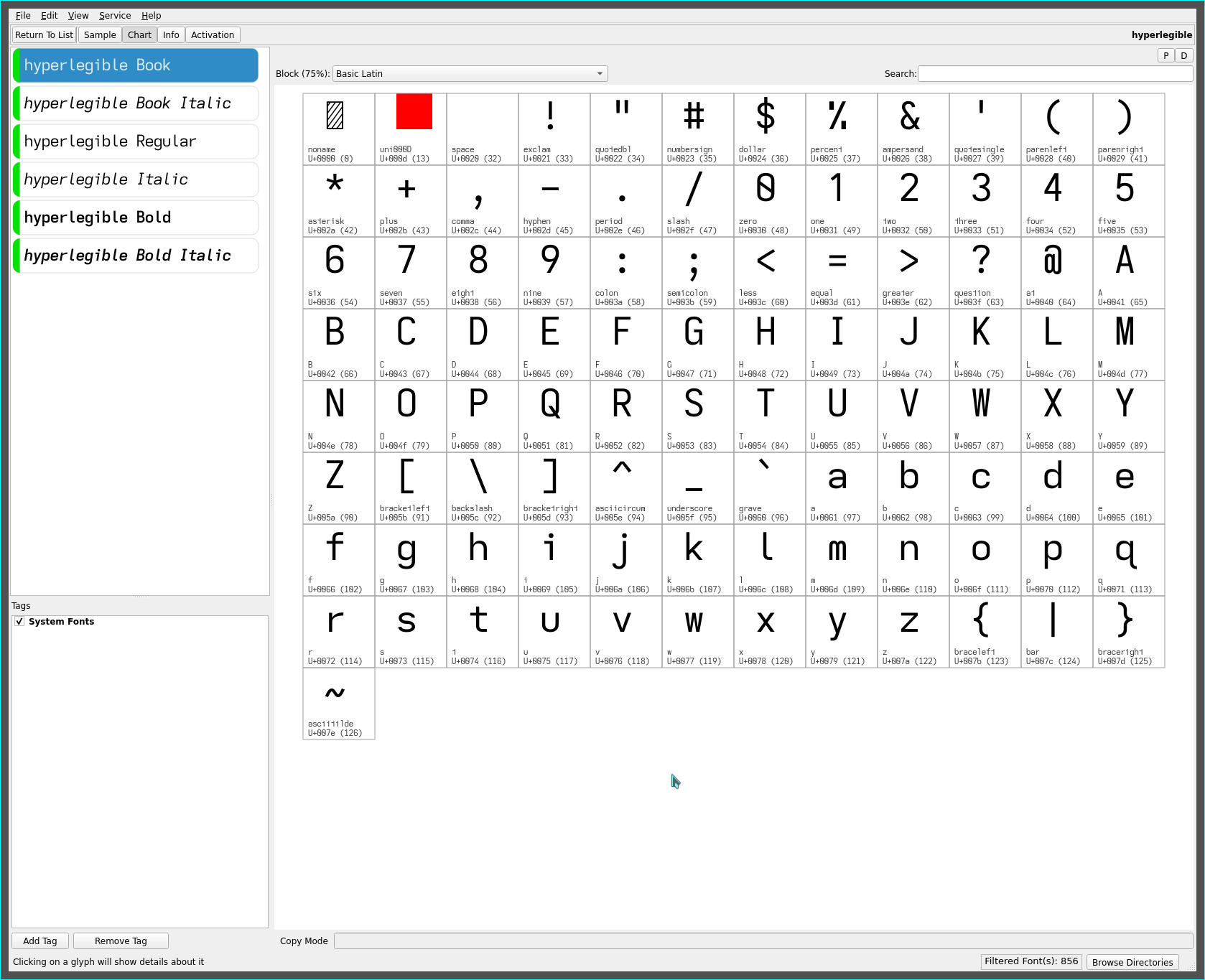
hyperlegible font

Some glyph shape differences are choices imposed by their monospaced character cell width—which exhibit wider side bearing for narrow glyph shapes I j l or are insufficiently wide for a more geometric representation within their cell width—for greater legibility on a computer display.
Some special characters are chosen, again, for the most “air”—notably with the dotted %, open & and Fira Sans @.
This font remained my go-to coding font until such time, i began to explore glyph sets for ereaders and dyslexia, resulting in the..
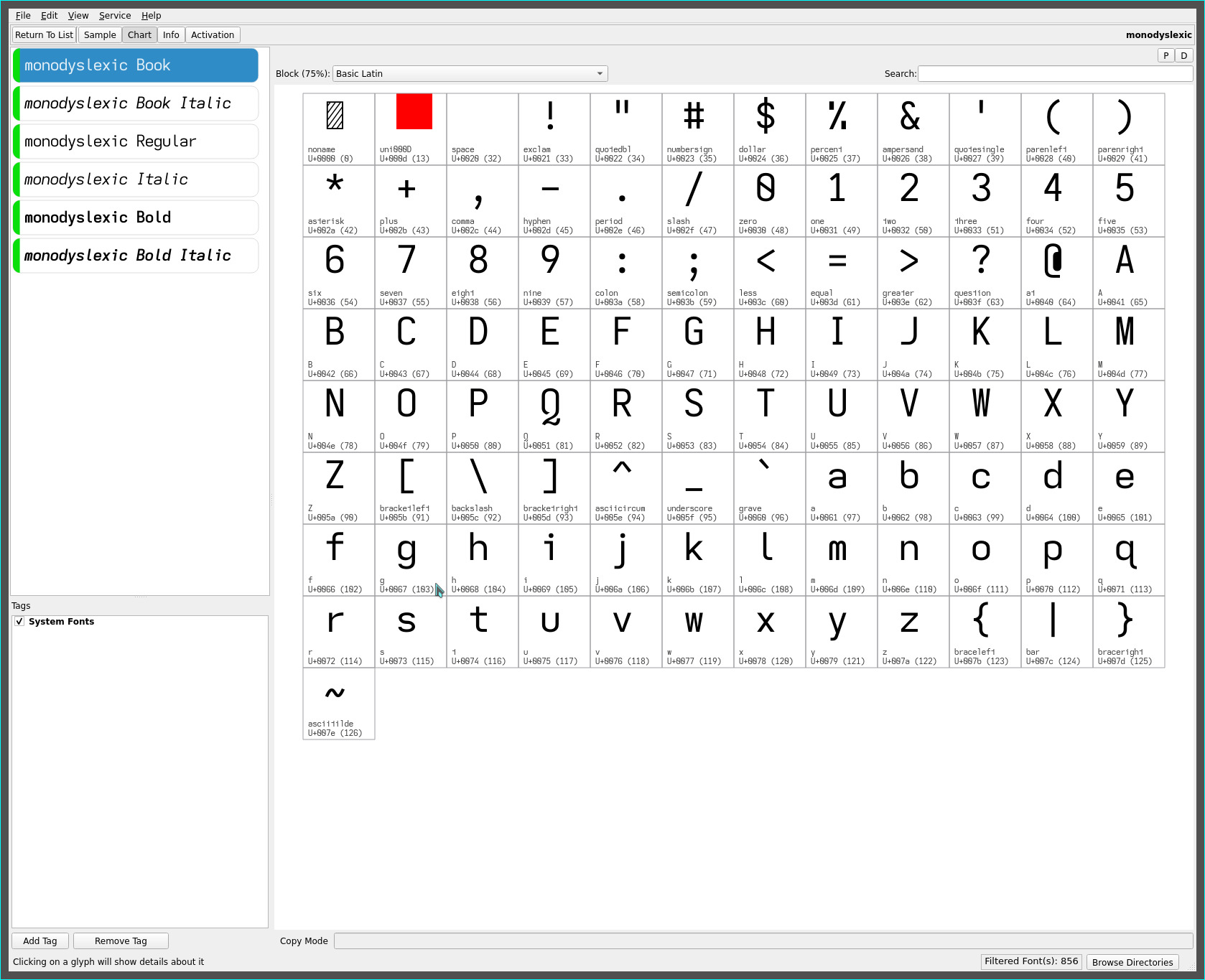
monodyslexic font
which eschews mirrored lower case glyph shapes, using instead a rounded b, toothed d, earless p, hooked q and earless m, straight n and toothless u glyphs.

The base 1 numeric and solid threefold @ symbol glyphs further heighten legibility. This source code font was my default for the ensuing years as i further explored monospaced ereader fonts, whose unique flair would eventually make their way into my current usage.
asymmetric t
the descending lower case f of the Univers Grotesk font heavily inspired explorations with (AFAIK, unique) descending caps, the recent extended lower case l and the wholly unique reverse asymmetric t.
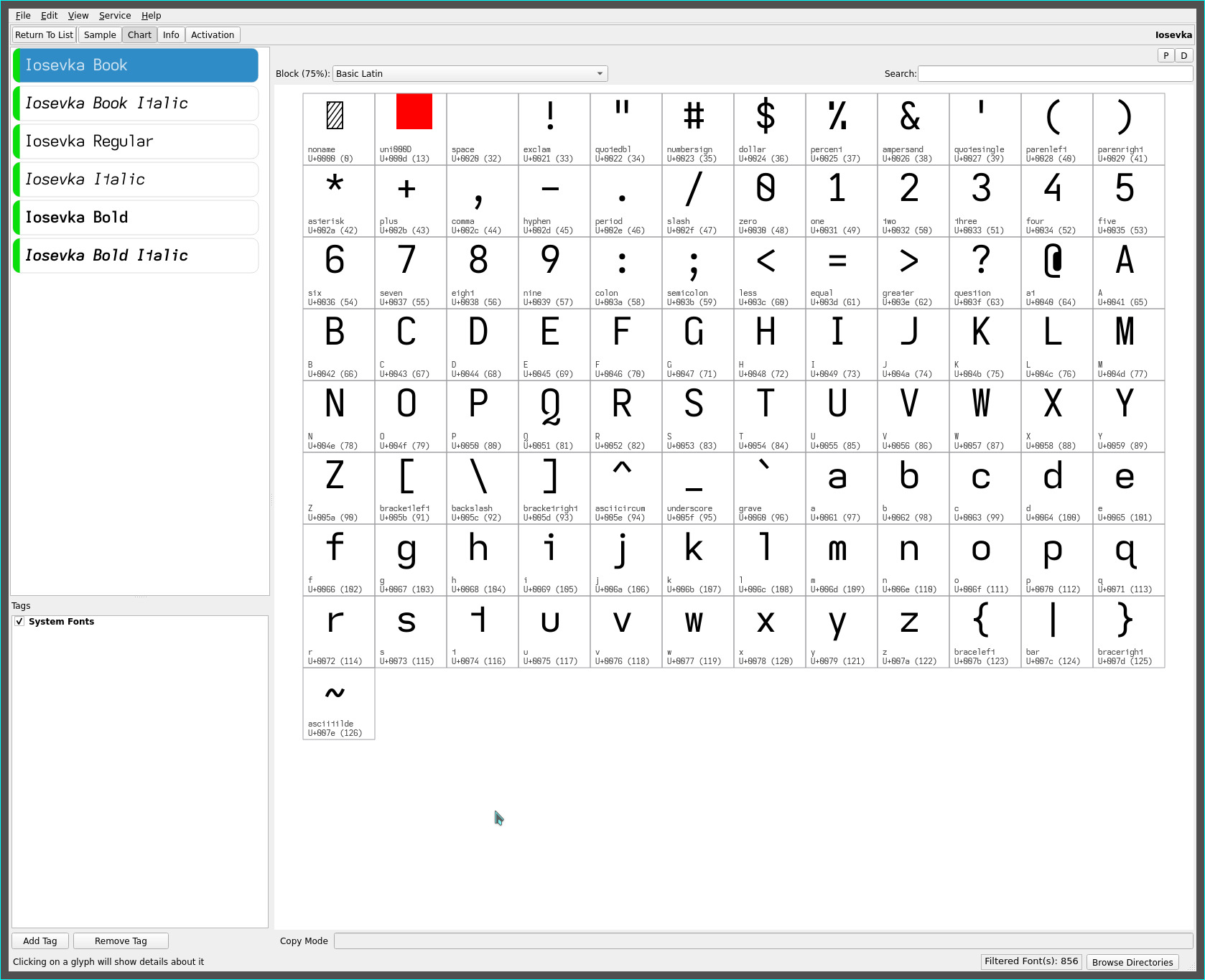
Immersed visual familiarity born of countless daily hours with these monospaced ereader fonts, unsurprisingly influence the glyph set of my personal “default” Iosevka source code font with their hooky l and reverse asymmetric t, and hookless capital G, and open number 4..

For text oriented markdown and email content, the descending capital I J T, extended lower case l and lower case descending f—and no-base 1 with double-spaced line height—produce the Iosevka-proof variant for a distinct writing font..

As always, YMMV.
repos
These fonts may be found on OneDrive.